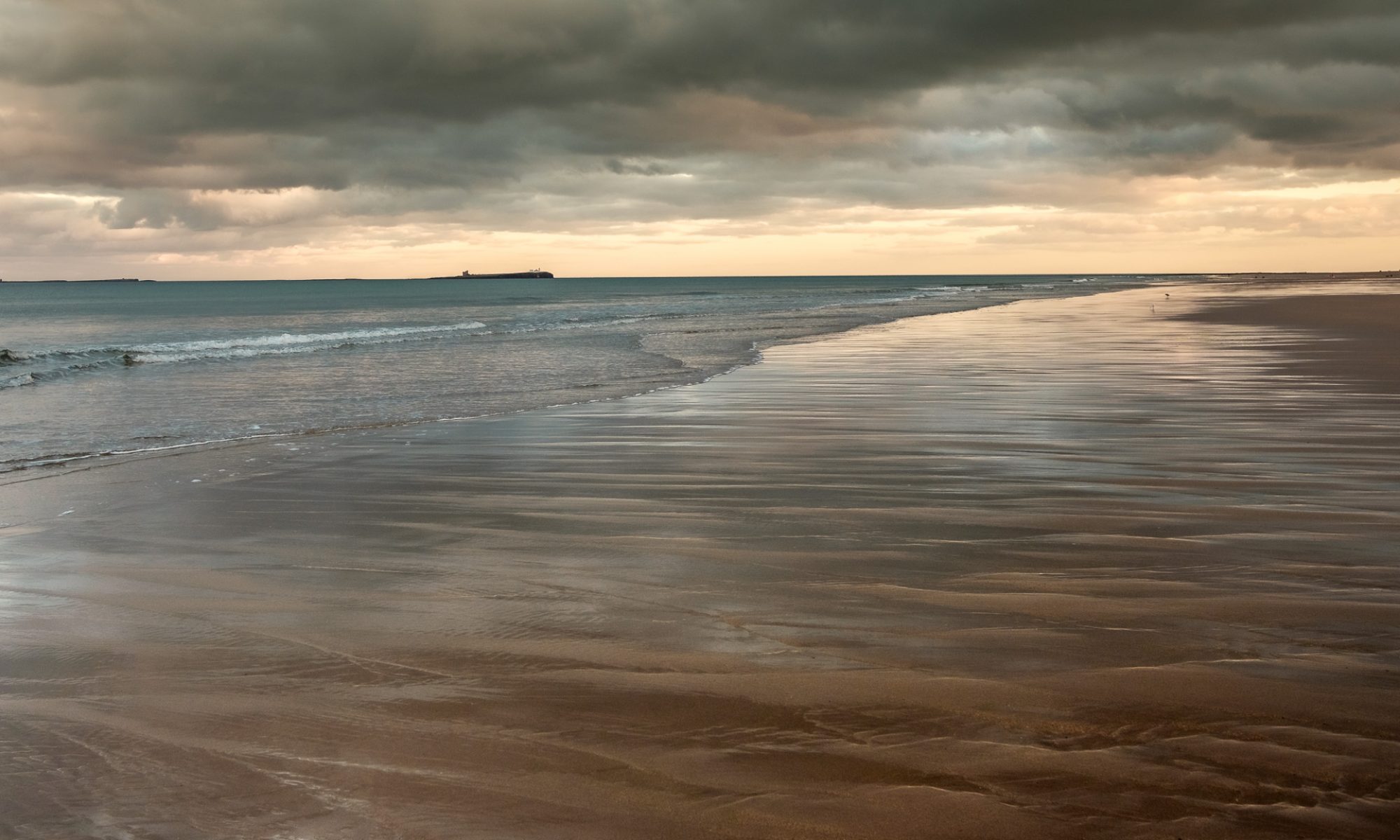
As I was writing these retrospective pieces about my pictures, it became glaringly obvious that I was finding it far easier to identify interesting monochrome images to document rather than colour ones. The Farnes is a recent picture that I thought would help unpick some of the reasons why.
At first I thought it was merely that I had been seduced by the colour in the scene and ignored everything else. That rather begged the question – just what was the “everything else” that I was seeing in my black and white pictures? Or was it a sort of “monochrome snobbery”: anything black and white must be inherently more interesting?
Robert Adams (Truth and Landscape, 1996) talks about the three truths landscape pictures can tell:
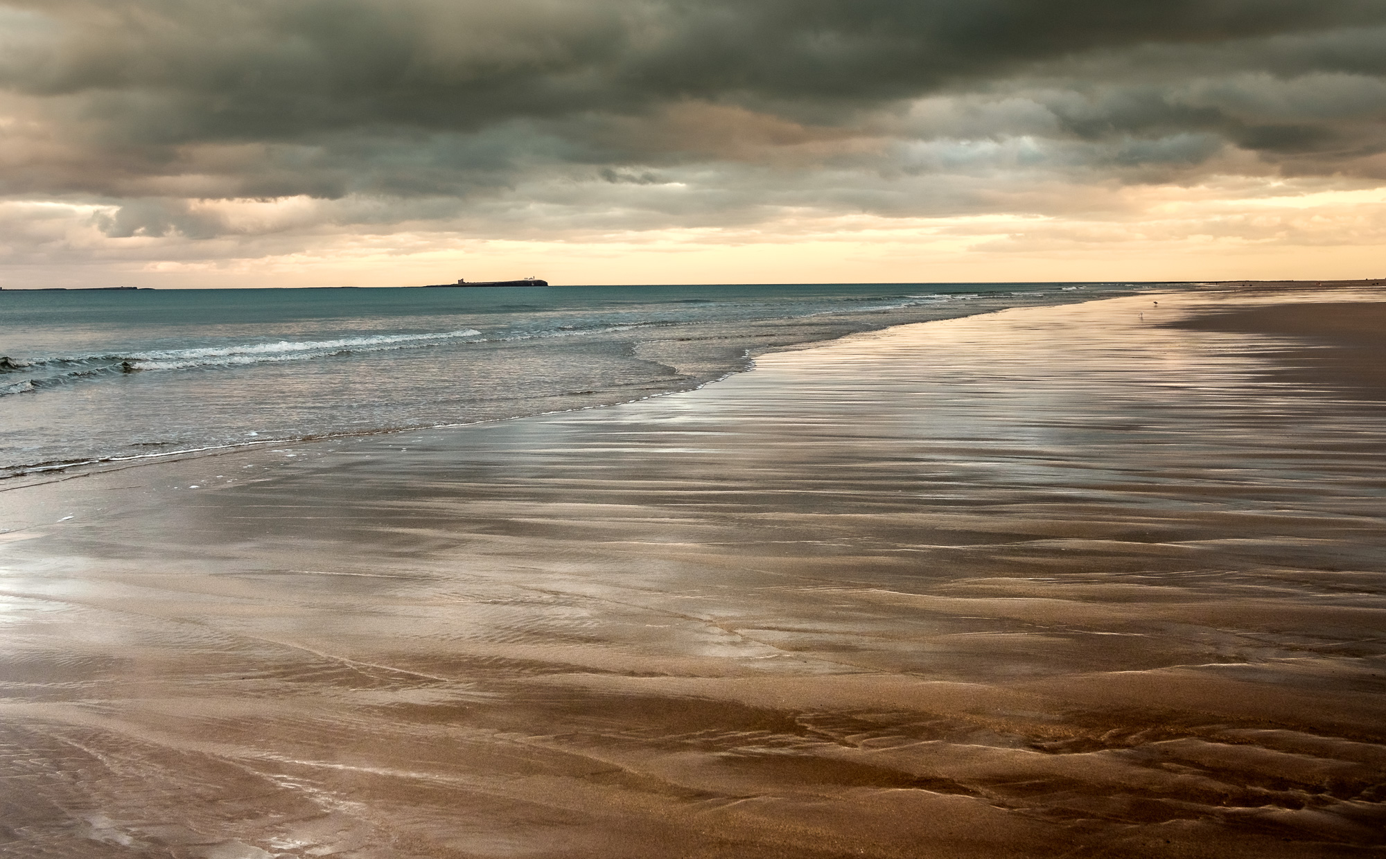
The image has geography: it was like that then. The tide was low, the light was as rusty as it appears, you can actually see those islands from here, and so on.
The autobiographical content is present too – I had to be there to take the photo of course. But short of selecting that particular scene and that particular crop, there’s not too much of me in there. Would someone else have framed it differently? Maybe, but not significantly I think. Perhaps the real autobiographical lies in wondering whether anyone else would have “seen” the potential and pressed the shutter release, then processed the image the way I did. It looks fairly obvious (to me at any rate) after the event. Only the viewer’s reaction can tell.
Is there metaphor? Does the picture help us discover the significance of the place?
There’s historical significance: I suppose you could make something of Cuthbert’s ruins out on the Farne, and refer to loneliness, or hermitage, or some such. Maybe the contrast between the ascetic recluse and the rich coppery colours in this sunset. But the history isn’t inherent to the image. You have to know too much before recognising there might be a significance. If I have to explain it, the metaphor evaporates.
So we’re left with the colour – a nice picture of a spring sunset. There are echoes of hand coloured engravings, and colours more typical of Tuscany, but with the clarity that comes from coastal light. The bleached blue of the sea harmonises nicely with the russet sand on the beach, close to a classic combination. There’s textures as well in sand, sea and clouds. The curve of the beach is attractive too, veering away to the right, taking in a couple of seagulls and heading for the setting sun.
You might quibble about the lack of foreground interest, but look again at the understated ripples in the sand, and the implication that they extend out to the horizon. Do you really need a boulder or a lump of seaweed to distract the eyes from that sweep of wet/dry land?
And the colours are why I took the photograph. Nothing more complicated than that.
But can you rely on me? Can the colour in a picture be an independent truth, a witness to its own accuracy? It’s so easy to manipulate the colour balance to create the effect you want. (Of course I wouldn’t do that to you ….!) Then again, you can adjust the tones in a monochrome picture to suit as well, so where does that leave us?
Does it just come down to personal preference? Maybe the answer is more prosaic: if you want to write about a picture, you probably need a bit more than pretty colours to latch onto. However if you want to simply enjoy the feelings engendered by some nicely matched colours, this could do nicely.
Despite my misgivings about talking too much about camera settings and other configuration matters which aren’t too important, these are the bits of technical information about this picture some folk find useful:
- Camera: Fuji X Pro 2
- Focal Length: Fuji 23mm f2
- ISO: 200
- Exposure: 1/240 at f5.6
- I use Lightroom and NIK software for sharpening and noise reduction.
More back stories
-
Safe Homecomings, 2016
Thoughts of home after the uncertainty of carefully picking your way up river past sandbars and shoals.
-
Wrong end of the telescope, 2019
You get the telescope out to try and see more clearly but it doesn’t help. It’s the wrong way round. And they’re getting further away.
-
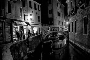
Late bar, Venice, 2008
By daylight the scene is nothing to write home about. But at night, nearly midnight, all those extraneous elements and colours just disappeared, and the atmosphere of the Venetian night took over.
-
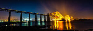
The Night Express, 2016
It’s as though the bridge is being cast in front of your eyes, a trail of molten gold flowing along the raised track.
-
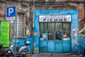
Piemme, Bologna, 2006
I remember feeling quite overwhelmed by the blue and didn’t really notice anything else for a while. I knew I had to take this photograph.
-
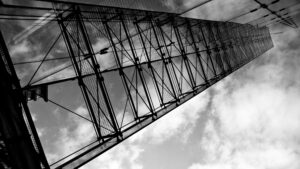
The Fin, 2011
Way back in 2011, I was fascinated by the buildings in Manchester – mainly the Victorian and Edwardian commercial architecture. There was lots to go at, and much that was in an attractive state of dilapidation. But there’s lots of modern buildings too and I regret not photographing more while I was there.
-
Distant Horizons, 2019
Sometimes, when you take a photograph, you know immediately what it’s about. Other times, you’re not so sure. This was one of those times.
-
A Longing for Distant Shores, 2015
It does seem I get inspired by bad weather. I just needed 50 seconds between squalls to get the long exposure shot, and I wasn’t getting them.
-
Bamburgh, 2016
Bamburgh, 2016: bringing myths to life – the story behind the image.
-
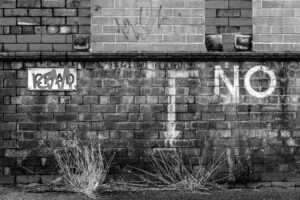
Chad! No! Manchester, 2012
“But it’s just a picture of a wall!” It’s also a picture of ambition moderated by pragmatism, of nostalgia, of seeing how things were, how things are now and how they got there.