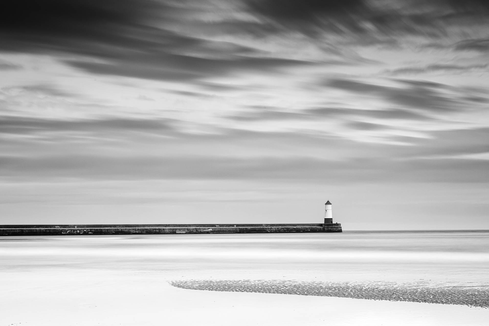
I’ve written previously how you need to be clear about your intentions for a picture when taking photographs. In this article I describe some of the aesthetic decisions I made when processing a raw file to get to the picture of Berwick Pier
My overriding intentions were to make an apparently simple image from a complex scene.
The start point
To start with, the image file from the camera looked nothing like the finished product:

I already had in mind a composition to include the pier and the sandbank immediately beneath it. Early on I had decided to make it a long exposure (2-3 minutes) to flatten out the water. I also wanted to darken the sky slightly using a graduated filter. The only one I had with me was a cheap plastic one hence the rather nasty colour cast.
Monochrome conversion
I realised pretty quickly that a colour version of this picture would not work. In any case, I had already assumed it would end up in monochrome so I started by making the conversion.
I used Lightroom exclusively to work on this image. However nothing in this article precludes you from using your own preferred software.

I also made the usual adjustments to the image – getting the black and white points set where I wanted them, adjusting the contrast and so on. For once I don’t remember having to correct the horizon though!
Simplify the composition
The foreground was far too fussy. I toyed with the idea of leaving it in but it meant the pier would end up splitting the picture more or less in half. That’s ok but it does mean you spend more time looking at the random ripples at the bottom of the picture than I wanted.
So the ripples had to go.

I wanted to retain the original aspect ratio (the shape of the picture) so I had to crop either the left or right of the picture. In the end I decided to place the lighthouse on the intersection of the horizontal third and the vertical third which meant the left hand end of the pier also had to go.
The happy result of that decision meant also that the end of the sandbar landed more or less on the left hand vertical third. In addition it was also positioned about a third of the way up between the edge and the pier.
This positioning makes it “comfortable” to view the picture. Things are where you might expect to look first, and your eyes are happy returning to the main objects in the image. This in turn makes the viewer more likely to stay looking at the picture for a while. The longer the viewer stays, the more well disposed they become.
With a less interesting centred composition, you wouldn’t spend so long looking. And as a result you would be more inclined to consider the image uninteresting.
Remove distractions
The last step was tidying away some more of the distractions. We’ve already lost the sandy ripples and the unwanted waves, so now for cloning out the flotsam and jetsam in the water.

Achieving my intentions
The result – a deceptively simple image with few distractions from the main event – the pier punctuated by the lighthouse. There is further interest from the sandbar which sticks out as far as the pier does. The viewer is tacitly invited to compare the man made structure with the more apparently natural feature. The irony is the sandbar only exists because the pier interrupts the flow of the tides along the coast.
More articles On Seeing
-
Level horizons and constructive criticism
Level horizons are really just the tip of a critical iceberg. Here’s why you should consider going straight.
-
Expectations of Pictures
I got thinking about how we each bring our own expectations of how images work. What really interested me was how we deal with when that expectation is not met.
-
Material ingredients
Several years ago as we were building our new house, I was taken by the idea of recording some of the materials we used or found on the site.
-
Black and White Photography – Pictures for the Imagination
A very personal view of black and white photography.
-
Talk about your picture
Try this as an exercise. You’ve got three minutes. Describe your image and give me some idea of what motivated you. Intimidating? Impossible? Here’s how.
-
I saw the light
This year, a new camera has changed the way I take pictures. I’ll not break the habit of a lifetime – this won’t be a camera review – so this is all about how you see.

More articles On Landscapes
-
Ultra-w-i-d-e
Many photographers have a preferred genre, their comfort zone. A place where creativity arrives without conscious effort. For me, it’s ultrawide landscapes
-
In praise of trees
It might seem a bit odd starting an article on trees with something that is most certainly not a tree. For me though, it’s a tree in all but name.
-
Contract or assumption: what do I owe the viewer?
Is it realistic to expect a photographer to concern himself with his viewers expectation about the nature of photography?
-
Panoramas – taking the wider view
Exploring the potential of panoramas? From wide angle landscapes to more intimate close-ups.
-
Landscape pictures are what, exactly?
Well, that’s an easy question to answer isn’t it? Landscape is a picture of natural beauty somewhere in the countryside. Isn’t it? There, done. We’ve put that in its box, move on. But not so fast. That just raises more questions than it answers.
-
Fiddlers Ferry Panorama 2011
This image was part of a panorama project I undertook for a client in Oldham in the UK. You can clearly see, from 40 miles away the Fiddler’s Ferry power station on the Manchester Ship Canal.